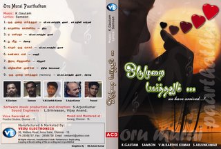
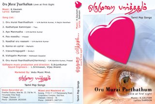
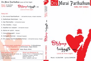
Gautam and his friends need your help dear Peak Day Blues readers... You can help the makers of Oru Murai Parthathum by giving your opinion as to which image given below will best suit the album cover (cassette/cd)... Please feel free to leave a comment as to the image u like the most... As usual, click on the pictures for a larger view... If anybody has a design of their own, you are welcome to send it across to Gautam and his team!
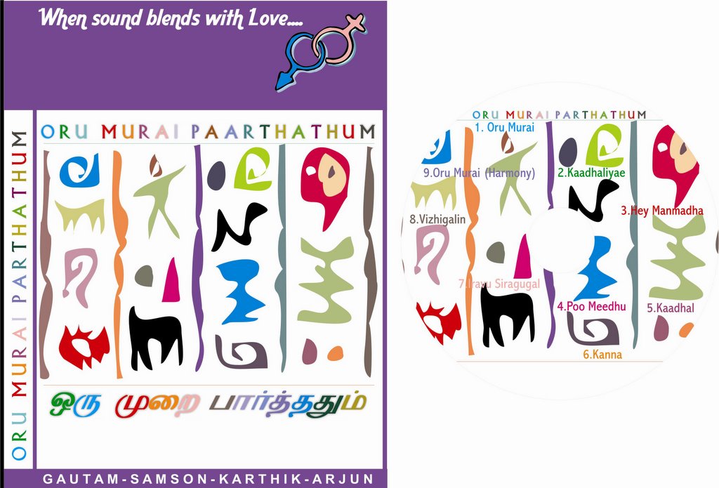
[Image 1]
[Image 2]

[Image 3]
[Image 4]
[Image 1]
[Image 2]
[Image 3]

[Image 4]

Img 3 looks cool... it has got a classic look... my vote goes to 3
ReplyDeletevoila!!! The last one is really cool and superb. I guess that perfectly goes along with the title. And moreover ...... well,,, what else can an expert comment on..
ReplyDeleteVoila!!! The last one is real good. I guess that goes along with the title.. and moreover.... well then, what else can an expert comment on?
ReplyDeleteI think image 1 would suit best...
ReplyDeleteAs its said "The eyes sees only what the mind is prepared to comprehend", I feel Image 3 goes best with the title - Renju
ReplyDeleteImage 3 is attractive...
ReplyDeleteHi..... on the second cover.. u change the title. I wonder who designed that cover for such a title. Although non are so catching (that's why u still are in doubt!!) I chose the third one, not becasue it is the best but best than the rest.
ReplyDelete...Xander
my vote goes for the third one..
ReplyDeletesunup..
I choose the first Image. That's marvelous.........!!!
ReplyDeleteThe ultimate one the third...
ReplyDeleteHi...Image 3 is SUPER!!! It goes with the Title of the album.
ReplyDeleteHi...Image3 is SUPER!!! It goes with the Title of the album.
ReplyDeleteWe vote for the third one...!!!
ReplyDeleteALL THE BEST TO BE A GRAND SUCCESS!!!
GK, Karthick, Hari, Sashi, & Vishu.
image 3 is superb and my vote is for image 3.
ReplyDeleteImage 1 looks really good, first is the best pls have that. Good luck.
ReplyDeleteimage 3 is really good
ReplyDeleteimage 1 is the best. all the best.
ReplyDeleteI vote for Image 3. The eyes are wonderful and suits to the topic.
ReplyDeleteSureshk
My vote is for Image 3. It suits to the topic well.
ReplyDeleteImage3 is really superb!!! It goes with the Title of the album....
ReplyDeleteImage 3 is good among the others. It will become the best with some alterations, if only you are planning one.
ReplyDeleteThe eye is so lively and expressive. But the picture of the heart looks one like a cookie or a candy. There is no life. Give some life to the heart it will be wonderful.
Lively and expressive eye along with a lively and a pounding heart will be the most suitable pictures for this title.
Image 1 looks good and very professional. My choice - Image 1.
ReplyDeleteI feel the the colour of the heart in Image 3 looks a bit bright. If you are going in for the third Image, try to see if you can do something about the colour of the heart displayed.
All the best for Gautam and team. Way to go, guys.
Margaret.
Hi,
ReplyDeleteImage one is the best, that one really projects the mood of the title.
I vote for the first one. Please put the first image. All the best.!!!!!
ReplyDeleteForgot to add this ...
ReplyDeleteGautam, why don't you try change the thumbsize photographs of yours and your team on the left hand side.
All the photographs are so dull. You know you are getting into a fantasy market that gives more importance to "looks" as well.
The album is for youth, photographs of yours too should be bright, brisk and should tell the tale of your album.
Cheers!
(p.s: Your smile in the photograph is literally dulled because of lack of bad light)
Hi..Image three is good.
ReplyDeleteThe eye is very attractive and it express the title in lively manner. But the hearts used in first image suits well to this lively eyes.
Best wishes for ur journey...